The YMCA in the United States
Today, the Y engages more than 10,000 neighborhoods across the U.S. As the nation’s leading nonprofit committed to helping people and communities to learn, grow and thrive, our contributions are both far-reaching and intimate-from influencing our nation’s culture during times of profound social change to the individual support we provide an adult learning to read
By nurturing the potential of every child and teen, improving the nation’s health and well-being, and supporting and serving our neighbors, the Y ensures that everyone has the opportunity to become healthier, more confident, connected and secure.
Here’s a glance at our rich history, and a snapshot of our many successes over the last 160 years on behalf of the individuals and communities we are privileged to serve.
Founding | 1800 – 1860s | 1870 – 1890s | 1900 – 1950s | 1960 – 1990s | 2000 – present
History of the Y Logo
 |
1881 – The Ninth Conference in London approves the first Y logo, which highlights Y values by featuring a reference to John 17:21: “That they may all be one…as we are one.” |
 |
1891 – Luther H. Gulick, M.D., proposes a red triangle as the Y symbol. The equal sides of the triangle stand for “man’s essential unity, body, mind and spirit, each being a necessary and eternal part of man, he being neither one alone…” |
 |
1895 – The annual convention of the U.S. and Canadian Ys authorizes adding the triangle to the old World Alliance insignia. |
 |
1896 – The logo is simplified and a second ring is added. It is said the second ring represents friendship and love without end among individuals. This remains the Y’s official emblem. |
 |
1897 – The everyday logo from 1897 to 1967 is the red triangle. |
 |
1967 – The Y creates and trademarks the logo with the triangle and bent bar. |
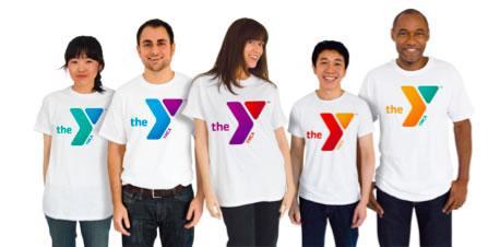
Inside our New Logo
The Y’s new visual system reflects our true identity: a caring, people-oriented organization that is devoted to the cause of strengthening communities. Our refreshed logo, for instance, is bold, active and welcoming, suggesting our determined commitment to social progress. Plus, the many colors reflect the vibrancy and diversity of our communities and activities.


